WhatsApp Brazil
Payment Requests
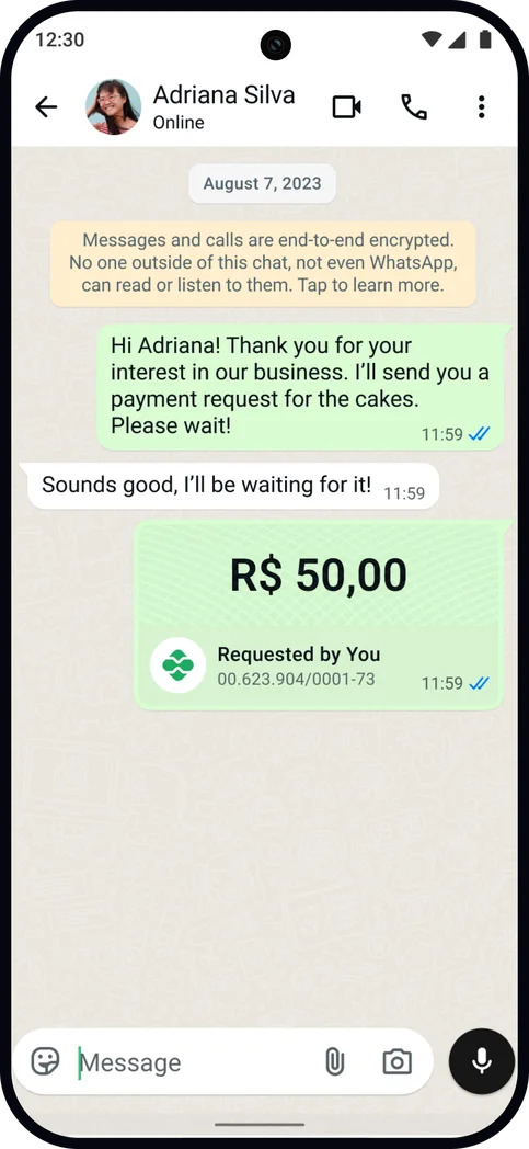
In Brazil, businesses leverage WhatsApp chats to sell goods and services and get paid through Pix, the country’s instant payment system. An earlier attempt to structure these financial transfers through a payment request flow caused Pix transactions to fall about 15%. Instead of abandoning the flow entirely, I ran a four-variant experiment to determine which part had failed. The redesign shipped to every SMB merchant and transformed the previous loss into a 4.8% lift.
No structure, and no amount
For many Brazilian businesses, the shopfront is a WhatsApp thread. Someone asks a baker for a cake, a seamstress for an alteration, a shop for a delivery. The order, the haggling, and the payment all remain in the same conversation. Money moves through Pix, the central bank’s instant payment system, which settles in seconds and identifies an account through a short key rather than full bank details.
Originally, payment requests lacked a consistent framework. The merchant would send their Pix key, followed by the customer copying it, pasting it in their bank app along with the amount owed, and paying directly there. With the onus on the customer to reliably provide the amount, confusion, inconvenience, and even fraud were common. To remediate this, a first attempt at structuring payment requests required an amount on every request.
Understandably, this subverted both merchant and customer expectations, and as a result, Pix transactions dropped about 15%, leading the team to pause the experiment. However, structured amounts remained necessary to land, since they would be the backbone for native and one-tap bank payments. It was time to dig into what exactly was causing the experiment to fail, and spin up actionable hypotheses.
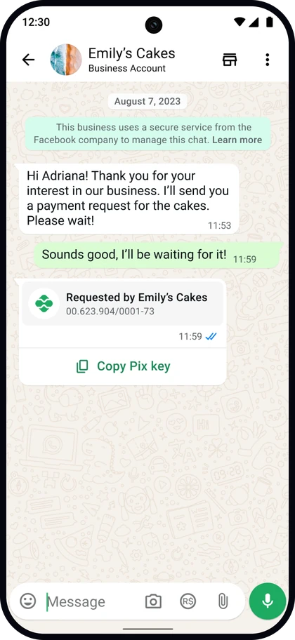 The key arrives
in the thread
the amount is manually noted
in a bank app
Isolating the cause through four variants
When it came to translating hypotheses to designs, we could not afford to be simplistic and miss the underlying reason altogether. The drop in transactions may have derived from the mandatory field, from where the field sat, from the interaction it demanded, or simply from the shock of a new pattern replacing a familiar one.
To address this ambiguity, I designed four variants, each testing a different hypothesis about the cause of V1 failing. After aligning component usage with the core WhatsApp design team, I partnered with engineering in launching a live experiment that incrementally ramped from 3% to 15% to 50% to 100%. I prototyped all four variants using Claude Code first to lend substance to each treatment and provide interactive grounding for the team’s discussions.
V1 · control
Amount required
The treatment that cost 15%, used as the control.
V2 · shipped · +4.8%
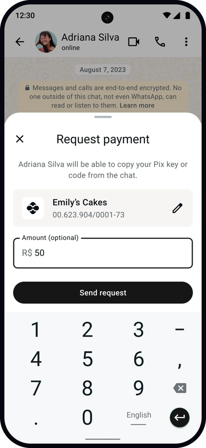
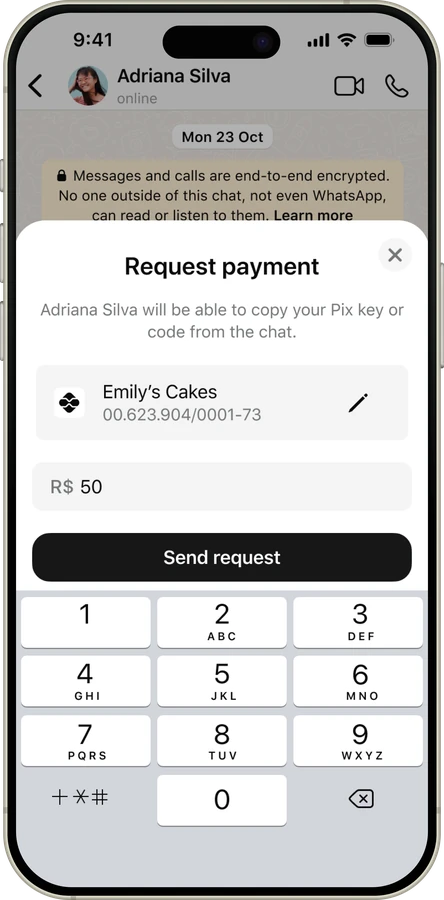
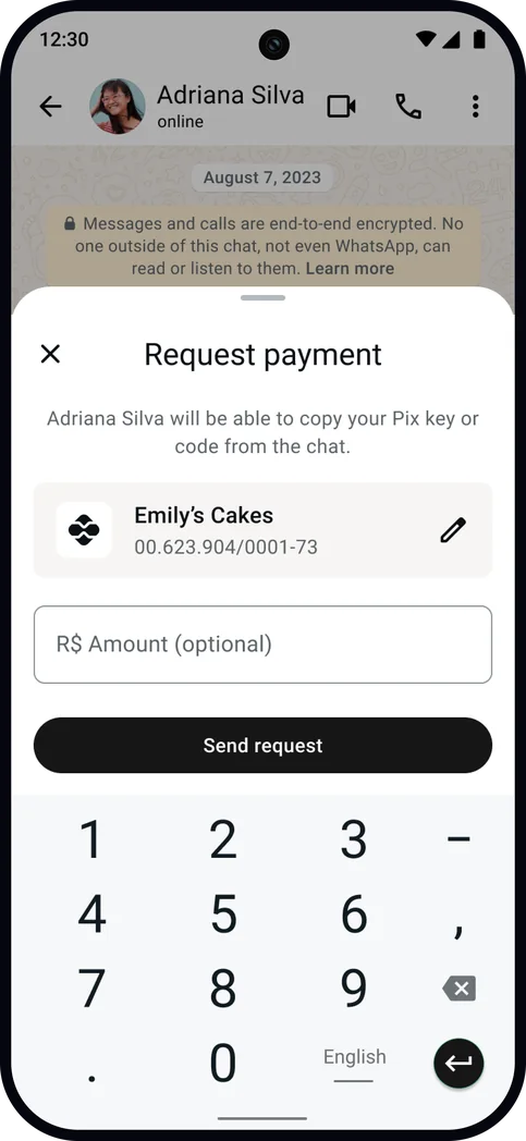
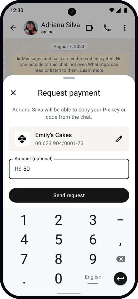
Optional, half sheet
The winner! Moved Pix transactions and requests sent.
V3
Adding an amount helps customers pay the correct price.
Send requestRequired, explained
Tests the need for education around adding an amount.
V4
Adding an amount helps customers pay the correct price.
Send requestOptional, explained
Separates the field from the sheet height V2 also changed.
Across the variants, I followed a set of principles shaped by potential reasons V1 had confused and lost merchants:
Balancing levels of explaining a new paradigm
While working on the variants, I bumped against a recurring question: how much education does a new payment paradigm require? V2 left the interaction open without explanation and made the amount optional, while V4 added a full education sheet that opened before the screen with the amount field.
It took iteration and exploration to reach a consensus. I first attempted to fold visual education into the Payment Request screen but found it too crowded, so I compromised with a bottom sheet layered on top, set to appear three times before permanent dismissal and to stop for good once a merchant sent a request. I ended up dropping this variant after discussions with my content design partner and collectively deciding that it front-loads explanation before the merchant has seen the field it describes. Research and partners further pointed out that people do not read bulleted explainer sheets, especially in Brazil where visual language is the top method of communication.
Two entry points, one destination
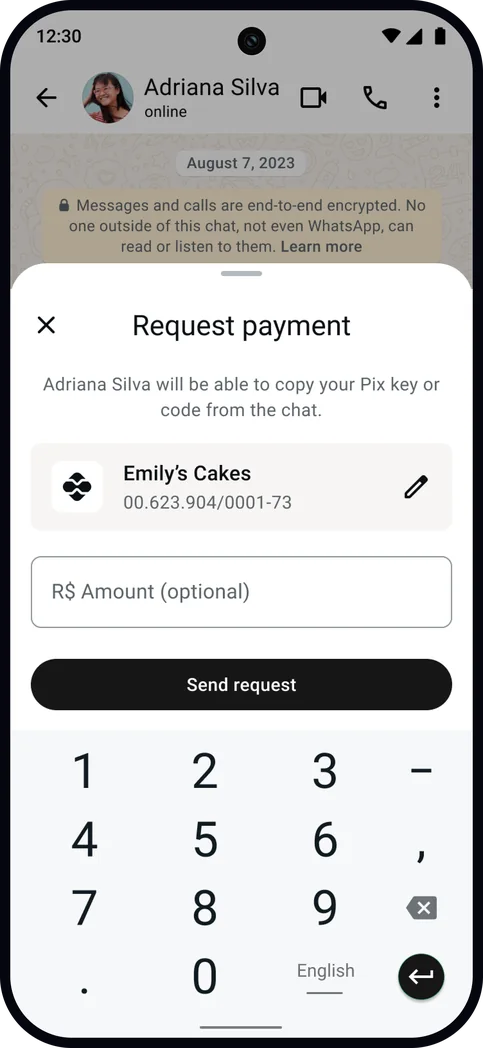
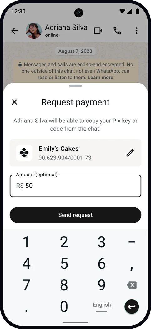
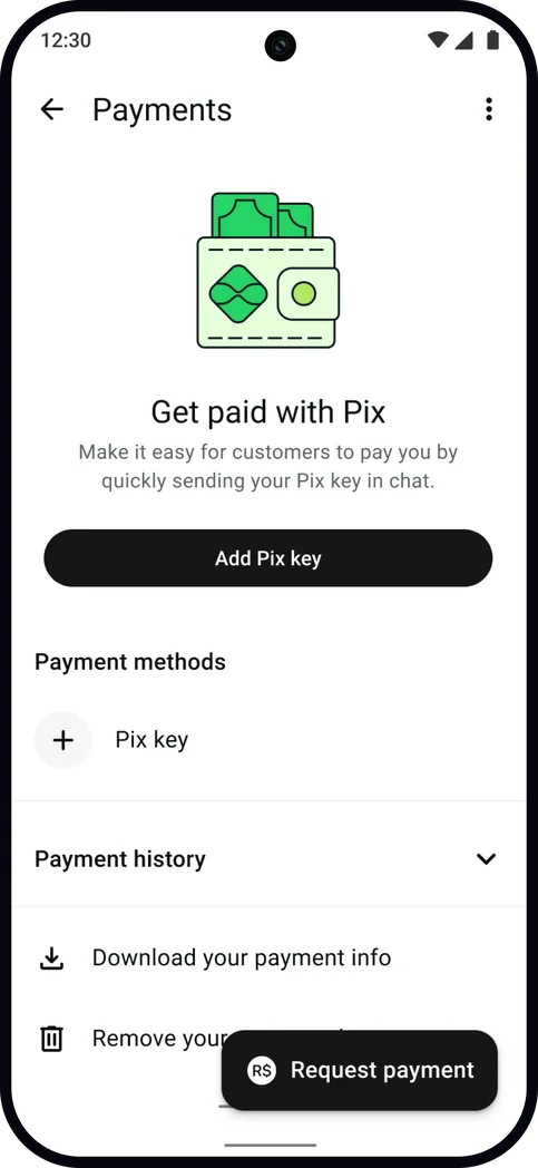
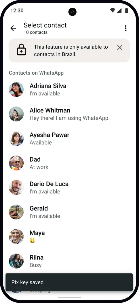
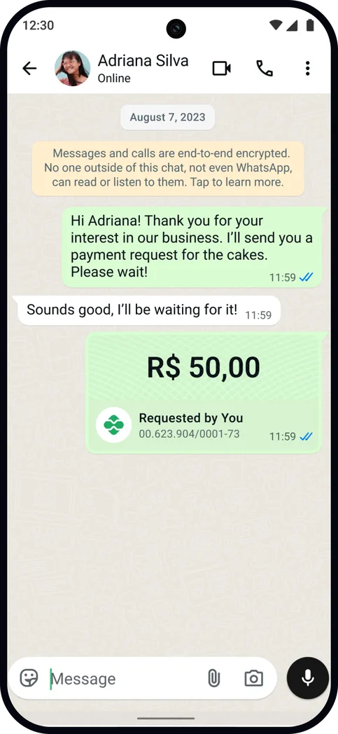
Merchants can initiate a payment request from two places: the attachment tray inside a chat, and Payments Home. The tempting move was to build each native to its own surface, which would have produced disparate experiences. Instead, I purposefully routed both to the same destination. Whichever door a merchant enters, they land on functionally the same payment request flow, with one important caveat. From Payments Home, where there is no conversational context, the merchant selects a contact from whom to request, while in a chat already conversing with a buyer, the request is pre-filled with that same buyer.
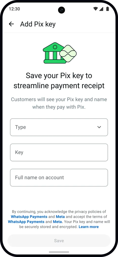
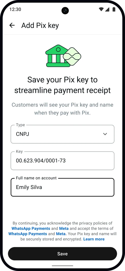
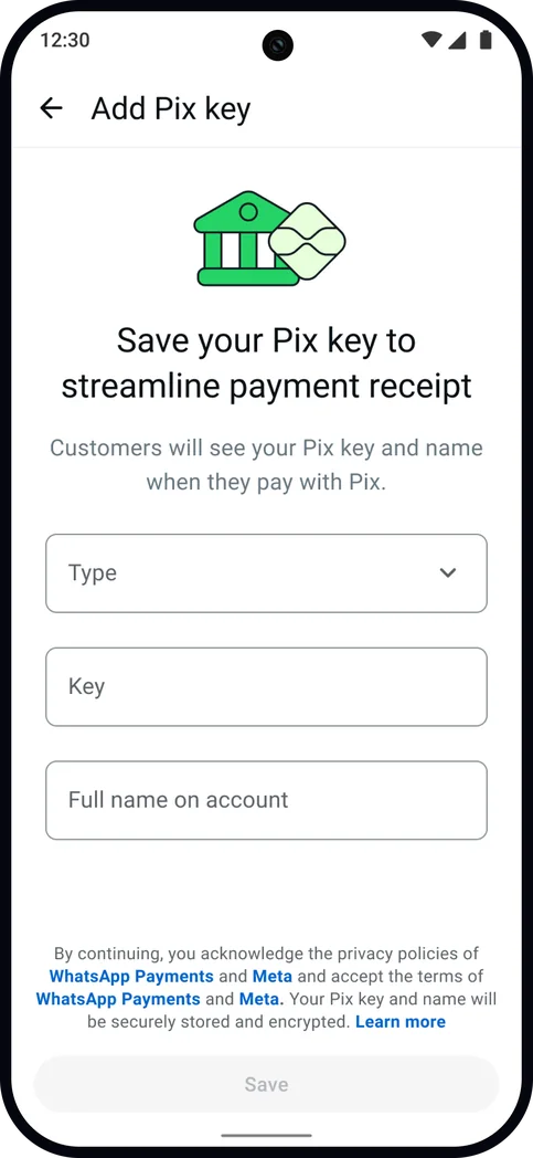
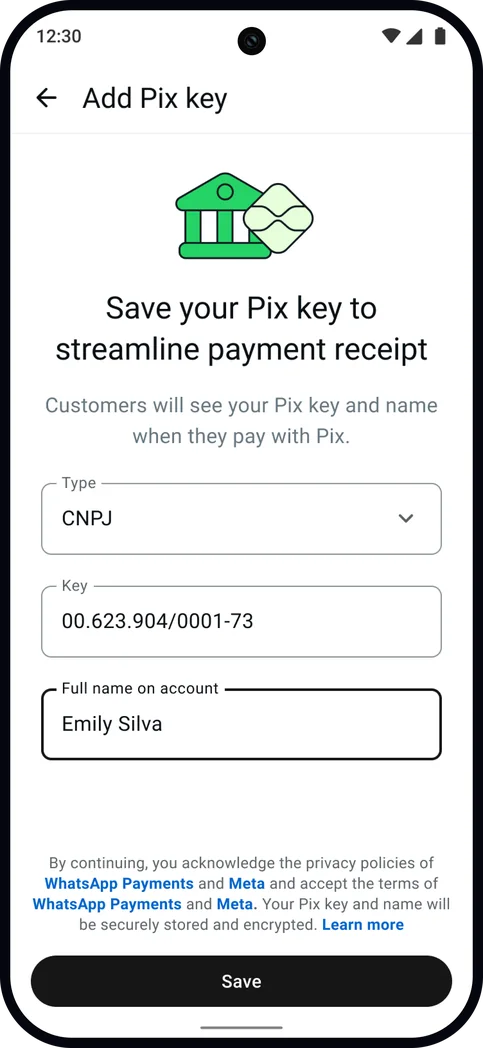
Both scenarios also fold in Pix key onboarding first, in the case where a merchant has not added one yet, so they never have to exit the current flow to complete onboarding elsewhere. Designing the two in parallel is what kept the work consistent, since every variant had to hold up for two entry points across both new and returning merchants.
from the attachment tray
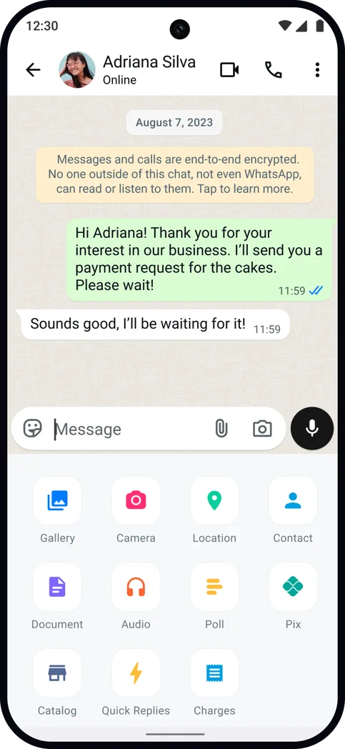
from Payments Home
A 15% loss, turned around
Ramped 3% → 15% → 50% → 100% · about 104K users per condition
Shipped 100% of SMB merchants, May 2026
The winning variant, V2, shipped to every SMB merchant in Brazil in May 2026, and it accomplished what V1 could not, reversing the loss of transaction volume instead of deepening it. Perhaps the real winning finding, however, was that merchants attached amounts voluntarily, despite it being optional. A significant share of payment requests sent had an amount enclosed, and the merchants who had included one continued to do so a week later, hinting at new habitual behavior. Forcing the behavior had cost transactions; offering it had apparently earned them.
The through-line revealed the deciding move was a design one. Setting the amount as optional rather than mandatory, and leveraging a more lightweight bottom sheet, had positively reoriented the feature and led to organic adoption.