WhatsApp Brazil
Payments Home
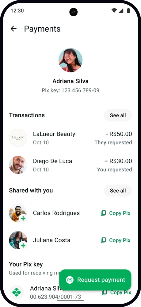
In Brazil, people send money to each other inside WhatsApp chats using Pix, the country’s instant payment system. Millions of those payments started in the app every month with no single place to manage them. I designed the consumer payments surface in Brazil, and it now anchors payment requests, split payments, and Pix sent directly in the app.
The gap at the center of WhatsApp Brazil
WhatsApp is the most-used app in Brazil, with ~165 million people on it, and a large share of them use it to move money. They do so through Pix, the central bank’s instant payment system, which settles transfers in seconds. Rather than full bank details, Pix identifies an account by a short key: a phone number, an email address, or a tax ID.

Inside WhatsApp, that exchange happened manually. One person sent their key mid-conversation, the recipient copied it with a button built into the message, then opened a banking app, pasted the key, and paid there. Native in-app payments were still in development, so I designed around the current behavior: Pix copy-paste.
None of that activity had a home in the app. Receipts stayed buried in whichever thread they were sent in, key management sat three menus deep in settings, and there was no transaction history at all, so finding last week’s payment meant first remembering which chat it happened in.
Deciding what one screen could hold
The architecture of Payments Home came down to how much a single screen could carry. I worked through a two-tabbed structure first, with account management on one side and transactions on the other, and decided against it once I determined the two tabs would compete for engagement and discoverability. To prevent bloat, I settled on truncating sections at 2 items max while showing enough information to communicate intent, and implementing secondary pages to house further actions and content.
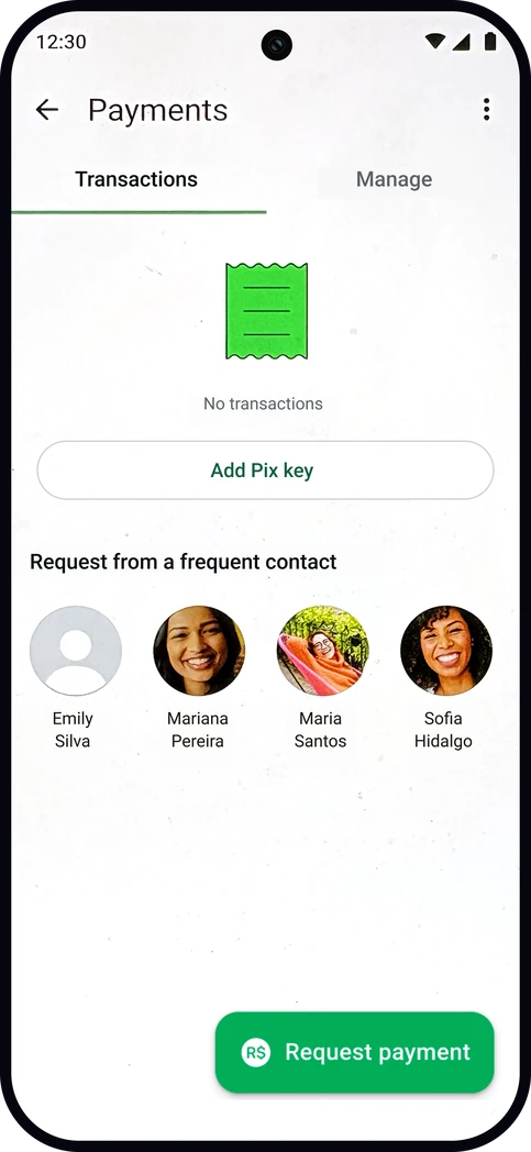 Explored Two tabs
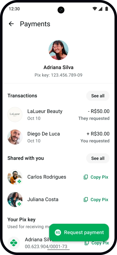 Shipped One screen
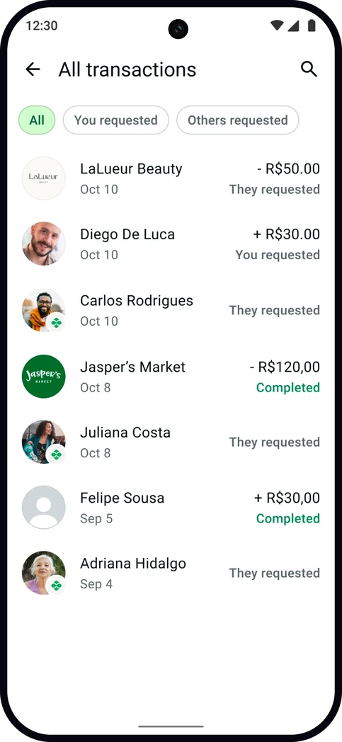
The harder call was Shared with you, a section listing the Pix keys people have recently sent you. Keys are tied to transactions, and user research kept surfacing the same behavior: people scrolling back through chats to find someone’s key so they could pay them. Duplicating a full keys UI in both places made no sense, so I split the work between them. Shared with you presents the keys on their own, ready to copy. The transaction list still records them, but only as an entry labeled Shared with you, with a Pix icon over the sender’s photo to mark it as a key rather than a payment. It has become one of the parts people respond to most, and it came from watching local behavior rather than the data model.
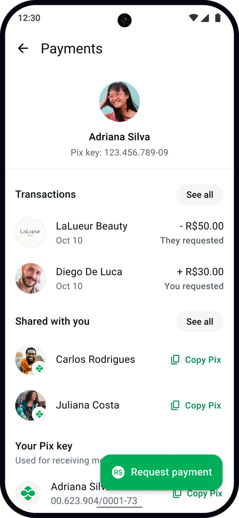
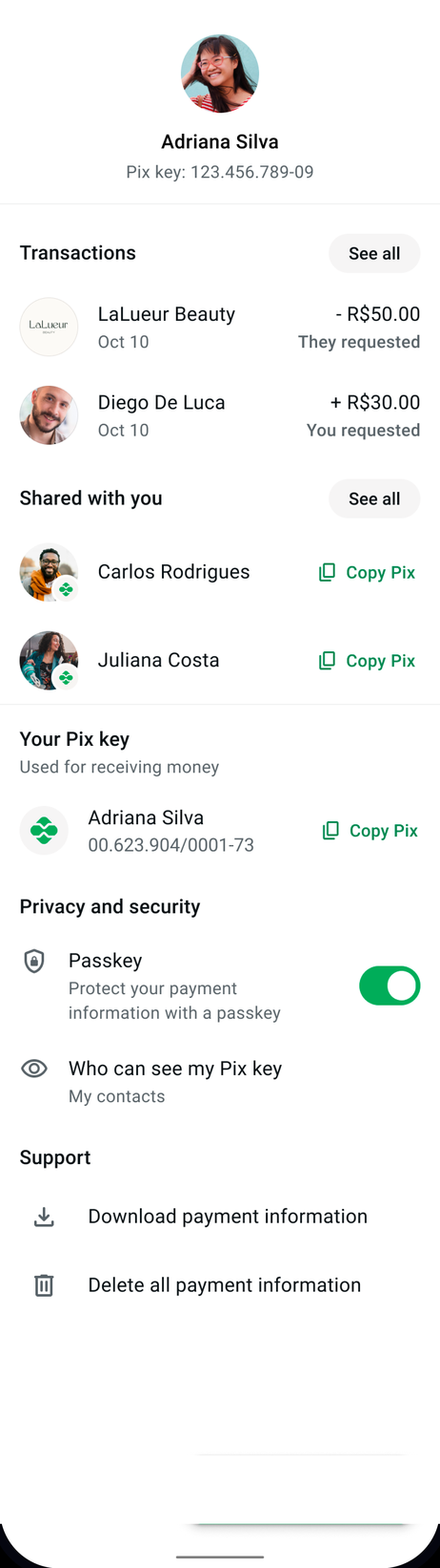

Front and center for safety, transparency, and quick access
Surfacing Pix keys that have been sent to you in chat so you can easily pay others
Persistent entry point for requesting a payment
Note: before native payments, only requests and out-of-app Pix were possible
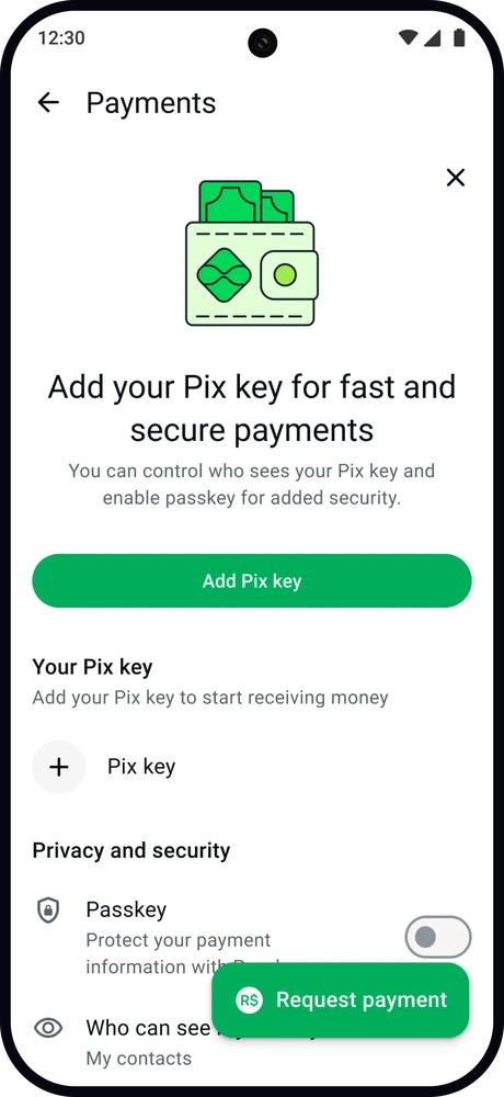
Persistent entry point to view and manage your Pix key, or your unique payment ID
Critical features for protecting payments: both transactions and personal identification
Fulfilling legal requirements around downloading and deleting payment information
Diverging from a leading market
Since I was designing for the Brazil market, I led with the belief that local behavior should determine the design, even when stacked against existing markets that were further along in development and traction. India had already shipped its own Payments Home successfully, lifting payment registrations by 8%, so there was real pressure to copy it screen for screen. The two markets are not the same underneath. India runs on UPI, its national instant payment network, while Brazil runs on Pix and did not have native payments within WhatsApp yet. Critically, Brazil also carries far higher rates of fraud and scams. I kept the parts that transferred, including the profile-centric model, a similar approach to transaction history, and persistent education for first-time users, and altered the parts that did not.
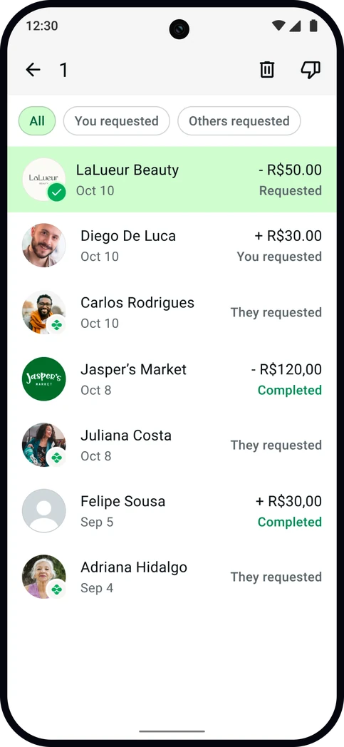
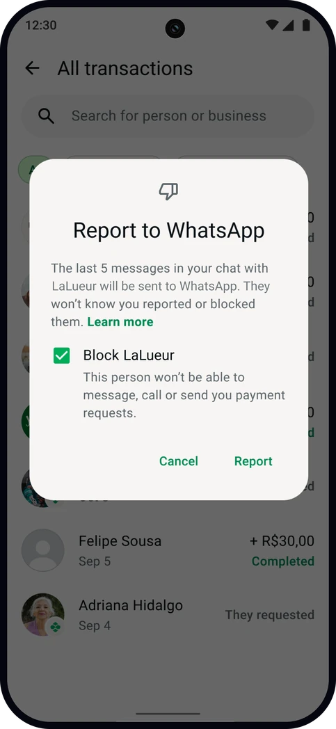
The main change was pulling transaction history to the front of the screen rather than one level down with a deprioritized entry point, which India had done. Someone in Brazil who has just been scammed needs to dispute the payment, report the account, or block the sender immediately, and that is not a task to bury. Every divergence took active advocacy in review, and the position I held throughout was that Brazil would not trade away trust and transparency to match another market’s experience.
Settling debates through prototyping
Interaction patterns and trade-offs between options are sometimes difficult to settle on paper, so I built something stakeholders could experience for themselves. Through a cocktail of Figma, Cursor, and Claude Code, with Obsidian as the brain, I created a working iOS prototype with a native SwiftUI build, complete with transitions and edge cases. Most of the work went into “teaching” the AI how to recognize and hold to our actual design system components rather than use vanilla OS elements, which was critical in keeping the fidelity close to production.
This prototype surfaced error and edge states early in the process, while the spec was still flexible and cheap to change. It also let leadership react to the strategy instead of debating individual interactions, and in 48 hours it produced more usable feedback than the static spec had in two weeks.
- Figma
- Cursor
- Claude Code
- Obsidianthe brain
Movement across every step of the funnel
Four-week controlled experiment · statistically significant
Most-used feature Privacy and control settings
These are early, habit-forming steps, and on a base of ~165 million people a few percent adds up to a large number of people paying for the first time. That privacy and control ranked highest confirmed what the market had been signaling all along: in Brazil, trust is the product.
The screen shipped to 100% of users and passed WhatsApp’s cross-functional design and build review as the first major approval of the half. The bet on extending what already existed rather than inventing something new is holding up in V2, which I am designing now, where the surface takes on new capabilities by following the patterns already in place instead of being rebuilt.